Verily’s principled approach to user-centric product design
Healthcare products often lose sight of the human side of care with their emphasis on safety, hygiene and clinical effectiveness.
As designers at Verily, we aim to make our products not only safe, but easy to use and enjoyable. Our goal is to “meet people where they are” which means we want to fit into their lives instead of making them change to adapt to ours. To do this well, we’ve established design principles to guide our work, align with user needs and ensure consistency in our approach.
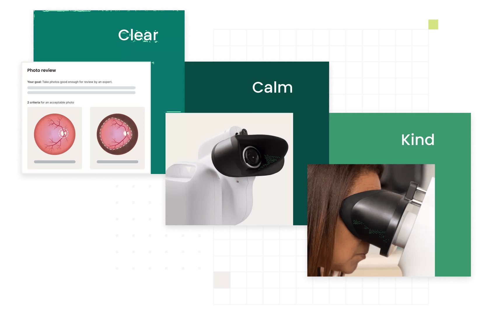
With this intentionality in our design, we think about every touchpoint a user may have with our products – both in their real world environment and within their individual health journey. Approaching challenges from a human perspective can yield some of the richest and most rewarding opportunities to innovate in healthcare design. This is why we utilize 3 design principles to guide every step of development. These 3 design principles are clear, calm and kind.
Clear
Being clear is about enabling focus on the things that are most important. We make products that simplify care management by making the design intentional, adaptable and balanced.
Calm
Being calm is about helping users feel less anxious. We make products that reduce stress while providing relief, by making the design soft, comforting and safe.
Kind
Being kind is about improving on the existing medical space. We make products that support a user’s life by making the design friendly, delightful and caring.
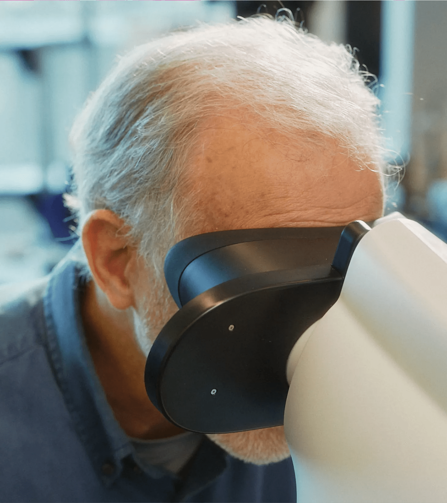
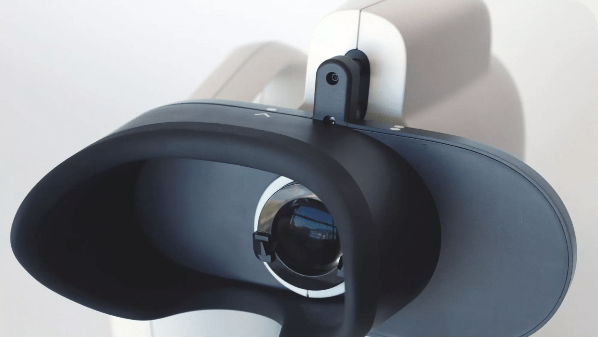
Here’s a look at how we applied our design principles to the Verily Retinal Camera (the camera), a lightweight and portable camera, built with advanced lighting and stabilization technology that captures high quality images of the eye.

The Verily Retinal Camera was the perfect opportunity for the team to put the design principles we developed into practice. In order to do this, we needed design creativity, engineering rigor, clinical insight and iterative user testing. We really pushed ourselves to be thoughtful with every aspect of the design. The device, the user interface and training materials set the bar really high for any other product that will follow.
Shannon Fong, Head of Platform UX
Design principle 1: Clear
The Verily Retinal Camera was designed with the intention of it being so easy to use that it could be placed in doctors’ offices and clinics anywhere for eye screenings, unlocking the opportunity for greater access to quality eye screenings.
To fulfill the design principle of being clear, we had to design a camera that simplified the screening experience for both patients and operators. This meant intentionally making the device for different patients, so that they knew what they needed to do, with enough adaptability that the clinical team could use it with minimal training.
Together, our clinical, Industrial Design (ID), Product Design Engineering (PDE) and User Experience (UX) teams partnered to ensure focus on providing high quality imaging and adaptability for patients by constantly asking ourselves the following questions to inform the designs – is the physical design intuitive? Is it easy to use? Is it adaptable? Through usability testing, we were able to find answers to our questions.
Usability testing helped us arrive at a headrest that was easy-to-use and adaptable
Throughout the product development process, we conducted many research studies with external participants of various levels of tech-savviness, age and dexterity. The final design was found to be more intuitive, effortless and less prone to patient errors while using the camera.
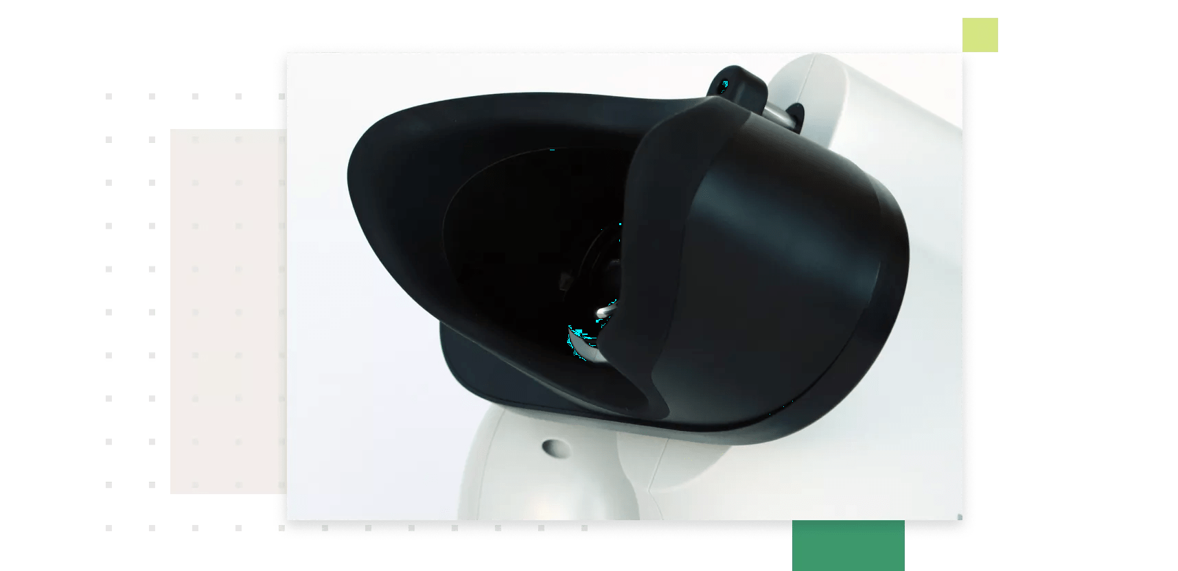
We found that to make the product less intimidating to patients we needed to integrate a sliding mechanism into the housing. The product design engineering team also utilized the results from the usability studies to develop an eye model with a headrest design that they adapted to fit across diverse users' faces.
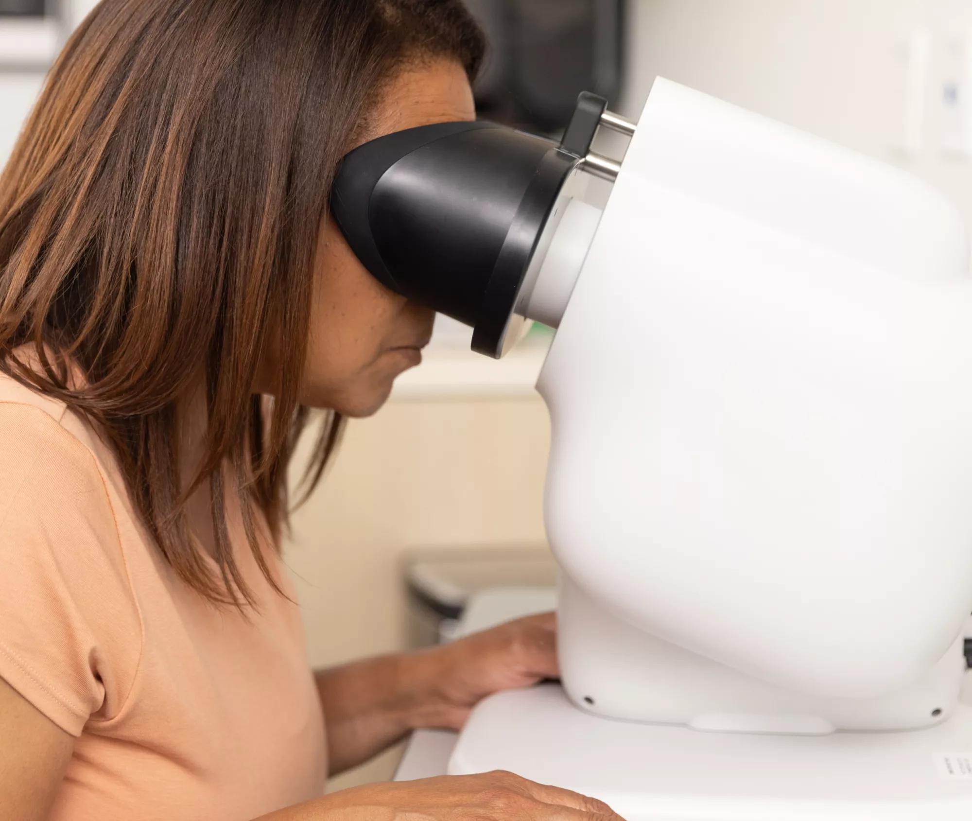

Designing an intuitive and comfortable headrest that guides the patient to place their head in exactly the right position without fine-tuning from the operator
For the camera operator’s needs, we segmented and simplified the camera’s User Experience and User Interface into easy to manage steps, enabling non-eye experts to use the camera with minimal training.
A simplified user experience and interface makes screening intuitive for the operator.
On-screen user scripts that are easy to understand
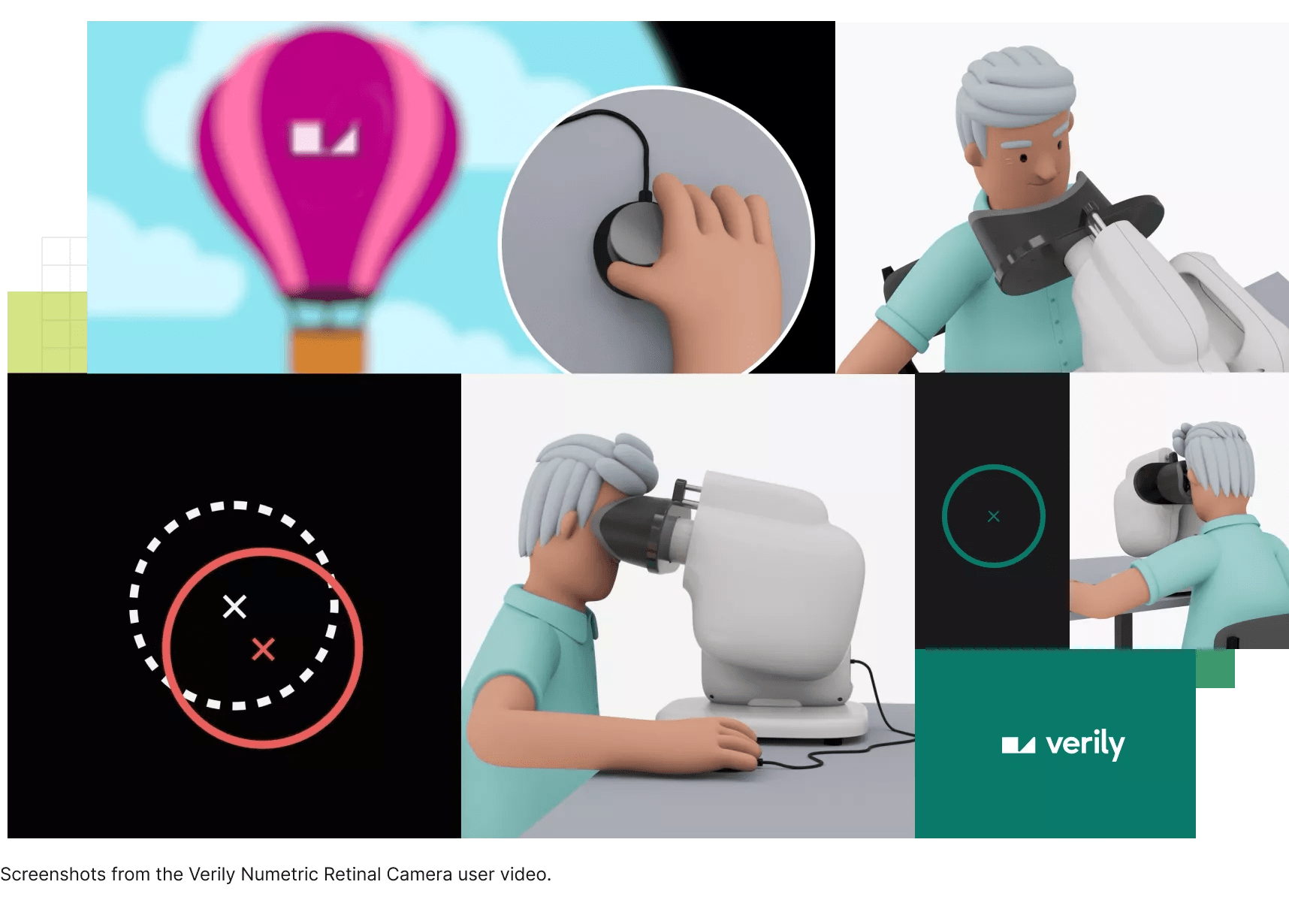
With our clear principle in mind, we created a user experience that focused on guiding non-experts through the screening process with the support of on-screen user scripts and videos. Scripts help operators know exactly what to say to each patient. Instructional videos are tailored to patients and translated into several languages, enabling deployments in multiple locations.
Our UX research team evaluated these scripts through multiple rounds of design, testing, and refinement, ensuring that they supported operators while using the camera on any patient.
Design principle 2: Calm
Encountering new medical devices can be overwhelming, so to put users at ease, our products are designed to be calm. On the Verily Retinal Camera, we intentionally used soft, rounded shapes to create an Industrial Design that patients are not intimidated by, paired with simple slate gray tones. We were thoughtful about our use of on-device graphics, using them in subtle ways that pair with our on-screen instructions.
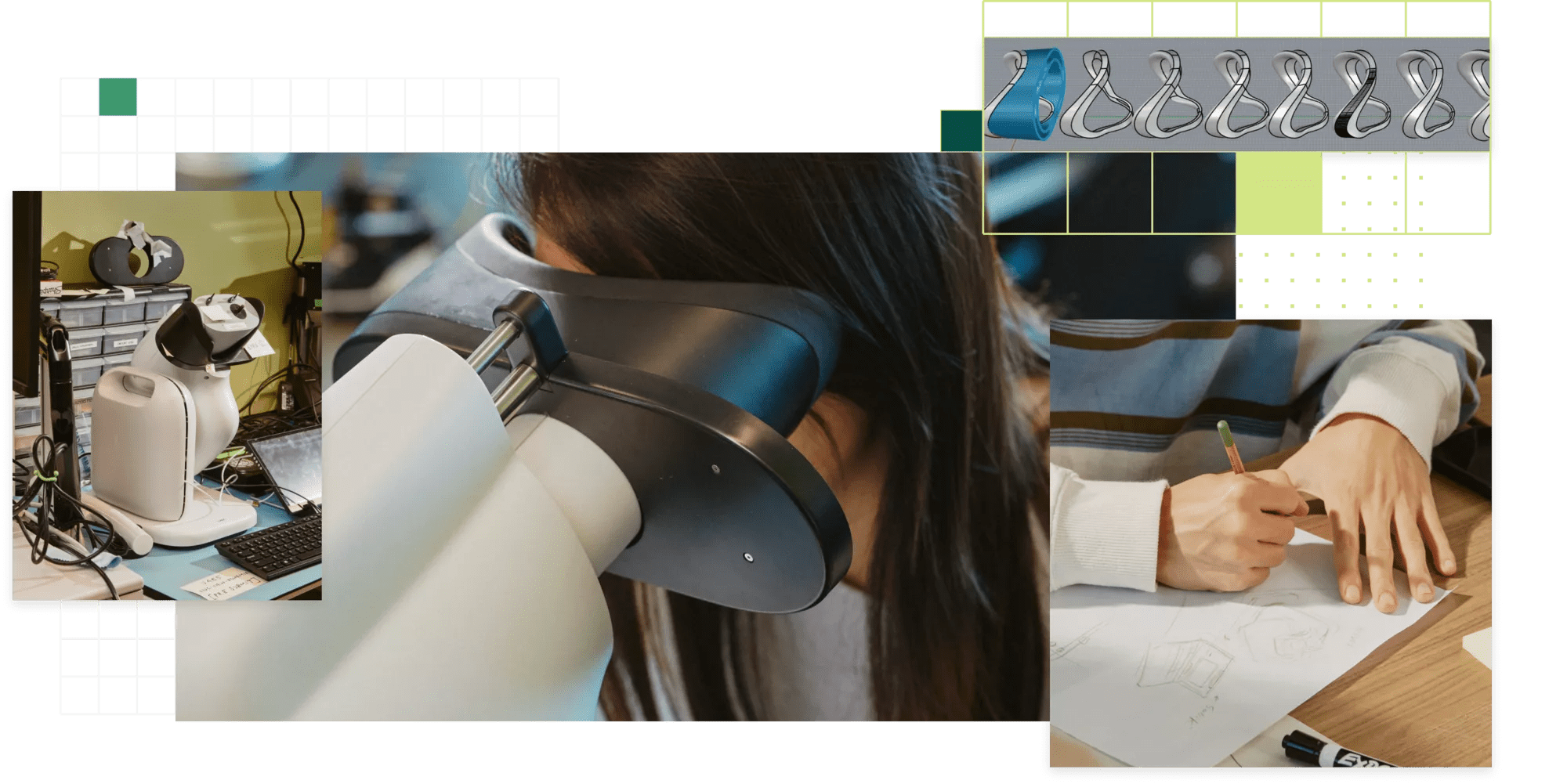
The use of soft, rounded shapes and materials put patient comfort at the center
Design principle 3: Kind
At Verily, we believe that healthcare products should exist to improve people's lives, and many fall short. To fulfill the principle of being kind, the Verily Retinal Camera is designed to enable more people to create high quality eye images and have a delightful experience while doing it. The Verily Retinal Camera breaks down a complex screening process into digestible steps that operators, even with minimal background in ophthalmology, can easily follow to successfully image a patient’s eye.
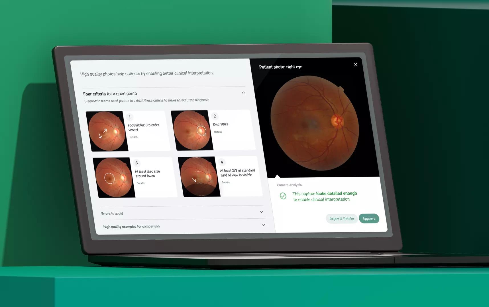
Image Quality Control Feature
One of the features on the Verily Retinal Camera is the Image Quality Control Feature, which reduces the burden on operators to determine photo quality and retakes if needed. We developed a flow that guides operators through photo quality review steps, with clear and concise guidance for photo review. The design was tested and refined over three formative studies, and validated in our summative testing to ensure we met the regulation and operators’ needs.
Clear, Calm, and Kind represent more than just words at Verily — they’re an approach to thinking through every touchpoint a person might have with our product. Whether our users are a patient, an operator, or a provider in the healthcare system, Verily products are designed to push healthcare forward.
Verily Retinal Camera is the recipient of the Bronze Award in Health Design and the People’s Choice award from IDEA, as well as an Honorable mention in Health and an Honorable mention best design of North America from the FastCo Innovation by Design Awards.

